Creating a calm and inviting atmosphere at home often starts with the colors you choose for your walls, furniture, and decor. Colors have a powerful effect on our mood and energy levels, so selecting the right hues can help turn your living space into a peaceful retreat. If you’re looking to transform your home with soothing colors but aren’t sure where to start, this guide will walk you through some helpful tips for choosing calm colors that complement your style and lifestyle.
Why Choose Calm Colors?
Calm colors are typically soft, muted, or cool tones that evoke feelings of tranquility and comfort. Unlike bright or overly saturated colors, calm shades help reduce stress and create a sense of balance. Using these colors in your home can:
– Make rooms feel more spacious and open
– Encourage relaxation and restful sleep
– Promote focus and clarity in workspaces
– Harmonize with natural light for a fresh ambiance
Popular Calm Colors for the Home
Before diving into how to choose calm colors, it’s useful to know which colors are generally considered calming. Here are some popular options:
– Soft Blues: Blue is often linked to calmness and serenity. Light blues, like powder blue or sky blue, are perfect for bedrooms and bathrooms.
– Muted Greens: Green connects us to nature. Soft greens such as sage or mint offer a refreshing yet peaceful vibe.
– Warm Neutrals: Shades like beige, taupe, and soft grays provide warmth without overwhelming the senses.
– Lavender and Soft Purples: These gentle tones can aid relaxation, especially in bedrooms or quiet corners.
– Pale Pinks and Peach: Soft rosy hues can add a subtle warmth and calming softness to any room.
Tips for Choosing Calm Colors
1. Consider the Room’s Purpose
The function of each room should influence your color choice. For example:
– Bedrooms: Opt for soft blues, muted greens, or lavender to promote restful sleep.
– Living rooms: Warm neutrals with hints of soft green or blue can keep the space inviting and peaceful.
– Home offices: Light, gentle colors that won’t distract but keep you alert, such as muted green or gray-blue.
– Bathrooms: Cool tones like pale blue or seafoam green work well to create a spa-like atmosphere.
2. Test Colors with Sample Swatches
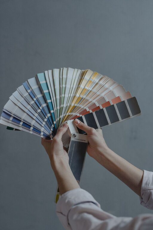
Colors look different depending on lighting and surrounding elements. Always test paint samples on your walls before committing. Observe them in natural light during different times of day and under your room’s artificial lighting. This helps avoid surprises and ensures the color feels right.
3. Use the 60-30-10 Color Rule
This classic decorating formula helps balance calm colors:
– 60% of a dominant calm color on walls or large furniture
– 30% of a secondary color for upholstery, rugs, or curtains
– 10% as an accent color for small accessories or artwork
This mix allows you to keep the overall calm vibe while adding subtle interest.
4. Go for Matte or Satin Finishes
Glossy finishes can reflect light harshly and feel less calming. Choosing matte or satin paint finishes can absorb light softly, enhancing the soothing effect of calm colors.
5. Embrace Natural Elements
Pair calm colors with natural materials like wood, stone, or cotton fabrics. The textures and tones of natural elements complement muted colors beautifully and add warmth without overwhelming the senses.
6. Think About Color Temperature
Colors can be warm or cool, and both have a place in a calm color palette:
– Cool colors like blue, green, and lavender tend to feel more relaxing.
– Warm colors like beige, peach, or soft pink can create coziness.
Balancing warm and cool tones in a room ensures it feels calm yet inviting.
7. Limit High-Contrast Combinations
Strong contrasts can be visually stimulating, which works against a calm environment. Instead, choose colors that are close together on the color wheel or that have similar tones to maintain harmony.
Creating Calm Color Palettes for Different Styles
No matter your style—modern, traditional, coastal, or rustic—you can select calm colors that fit your taste.
– Modern: Soft gray walls with pale blue accents and natural wood furniture.
– Traditional: Warm taupe walls paired with muted sage green upholstery.
– Coastal: Light aqua walls with sandy beige and crisp white trim.
– Rustic: Gentle olive green walls combined with warm beige and natural wood textures.
Additional Tips for Enhancing Calm Spaces
– Add plants: Greenery instantly refreshes a room and enhances calmness.
– Keep clutter minimal: Calm colors work best in tidy, organized spaces.
– Use soft lighting: Lamps with warm bulbs or dimmers help keep the ambiance gentle.
– Incorporate cozy textiles: Soft throws, cushions, and rugs add comfort without visual noise.
Final Thoughts
Choosing calm colors for your home is a wonderful way to create a serene environment that supports your well-being. By considering the room’s purpose, testing samples, and balancing color temperature, you can select hues that feel both beautiful and relaxing. Remember to combine your chosen colors with natural elements and soft lighting to complete the peaceful atmosphere. With these tips, you’re on your way to turning your home into a calm sanctuary.
—
If you’re planning a new paint project or refreshing your home’s look, keep these ideas in mind and enjoy the calming transformation that thoughtful color choices bring.